Web Programming Step by Step
Lecture 4
Page Sections and the CSS Box Model
Reading: 3.2 - 3.3; 4.1 - 4.2; 4.4.1
Except where otherwise noted, the contents of this presentation are Copyright 2009 Marty Stepp and Jessica Miller.


3.2: More CSS
- 3.1: Basic CSS
- 3.2: More CSS
The HTML id attribute
(3.2.2)
<p>Spatula City!  Spatula City!</p>
<p id="mission">Our mission is to provide the most
spectacular spatulas and splurge on our specials until our
customers <q>esplode</q> with splendor!</p>
- allows you to give a unique ID to any element on a page
- each ID must be unique; can only be used once in the page
Linking to sections of a web page
<p>Visit <a href=
		"http://www.textpad.com/download/index.html#downloads">
	textpad.com</a> to get the TextPad editor.</p>

<p><a href="#mission">View our Mission Statement</a></p>
- a link target can include an ID at the end, preceded by a
# - browser will load that page and scroll to element with given ID
CSS ID selectors
#mission {
	font-style: italic;
	font-family: "Garamond", "Century Gothic", serif;
}
Spatula City! Spatula City!
Our mission is to provide the most
spectacular spatulas and splurge on our specials until our
customers esplode
with splendor!
- applies style only to the paragraph that has the ID of
mission -
element can be specified explicitly:
p#mission {
The HTML class attribute
(3.2.3)
<p class="shout">Spatula City!  Spatula City!</p>
<p class="special">See our spectacular spatula specials!</p>
<p class="special">Today only: satisfaction guaranteed.</p>
- classes are a way to group some elements and give a style to only that group
(I don't want ALL paragraphs to be yellow, just these three...
) - unlike an
id, aclasscan be reused as much as you like on the page
CSS class selectors
.special {
	background-color: yellow;
	font-weight: bold;
}
p.shout {
	color: red;
	font-family: cursive;
}
Spatula City! Spatula City!
See our spectacular spatula specials!
Today only: satisfaction guaranteed.
- applies rule to any element with class
specialor apwith classshout
Multiple classes
<h2 class="shout">Spatula City!  Spatula City!</h2>
<p class="special">See our spectacular spatula specials!</p>
<p class="special shout">Satisfaction guaranteed.</p>
<p class="shout">We'll beat any advertised price!</p>
Spatula City! Spatula City!
See our spectacular spatula specials!
Satisfaction guaranteed.
We'll beat any advertised price!
- an element can be a member of multiple classes (separated by spaces)
CSS pseudo-classes
a:link    { color: #FF0000; }      /* unvisited link */
a:visited { color: #00FF00; }      /* visited link */
a:hover   { color: #FF00FF; }      /* mouse over link */
| class | description |
|---|---|
:active
|
an activated or selected element |
:focus
|
an element that has the keyboard focus |
:hover
|
an element that has the mouse over it |
:link
|
a link that has not been visited |
:visited
|
a link that has already been visited |
:first-letter
|
the first letter of text inside an element |
:first-line
|
the first line of text inside an element |
:first-child
|
an element that is the first one to appear inside another |
4.1: Styling Page Sections
- 4.1: Styling Page Sections
- 4.2: Introduction to Layout
- 4.3: Floating Elements
- 4.4: Sizing and Positioning
Motivation for page sections
- want to be able to style individual elements, groups of elements, sections of text or of the page
- (later) want to create complex page layouts
Sections of a page:
<div>
(4.1.1)
a section or division of your HTML page (block)
<div class="shout">
	<h2>Spatula City!  Spatula City!</h2>
	<p class="special">See our spectacular spatula specials!</p>
	<p>We'll beat any advertised price!</p>
</div>
Spatula City! Spatula City!
See our spectacular spatula specials!
We'll beat any advertised price!
- a tag used to indicate a logical section or area of a page
- has no appearance by default, but you can apply styles to it
Inline sections:
<span>
(4.1.2)
an inline element used purely as a range for applying styles
<h2>Spatula City!  Spatula City!</h2>
<p>See our <span class="special">spectacular</span> spatula specials!</p>
<p>We'll beat <span class="shout">any advertised price</span>!</p>
Spatula City! Spatula City!
See our spectacular spatula specials!
We'll beat any advertised price!
- has no onscreen appearance, but you can apply a style or ID to it, which will be applied to the text inside the
span
CSS context selectors (4.1.3)
selector1 selector2 {
	properties
}
- applies the given properties to selector2 only if it is inside a selector1 on the page
selector1 > selector2 {
	properties
}
- applies the given properties to selector2 only if it is directly inside a selector1 on the page (selector2 tag is immediately inside selector1 with no tags in between)
Context selector example
<p>Shop at <strong>Hardwick's Hardware</strong>...</p>
<ul>
	<li>The <strong>best</strong> prices in town!</li>
	<li>Act while supplies last!</li>
</ul>
li strong { text-decoration: underline; }
More complex example
<div id="ad">
	<p>Shop at <strong>Hardwick's Hardware</strong>...</p>
	<ul>
		<li class="important">The <strong>best</strong>
		prices in town!</li>
		<li>Act <strong>while supplies last!</strong></li>
	</ul>
</div>
#ad li.important strong { text-decoration: underline; }
4.2: Introduction to Layout
- 4.1: Styling Page Sections
- 4.2: Introduction to Layout
- 4.3: Floating Elements
- 4.4: Sizing and Positioning
The CSS Box Model (4.2.1)
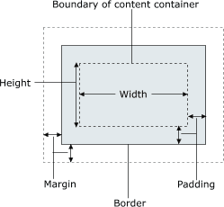
- for layout purposes, every element is composed of:
- the actual element's content
- a border around the element
- padding between the content and the border (inside)
- a margin between the border and other content (outside)
-
width = content width + L/R padding + L/R border + L/R margin
height = content height + T/B padding + T/B border + T/B margin
Document flow - block elements
Document flow - inline elements

Document flow - a larger example

CSS properties for borders
h2 { border: 5px solid red; }
This is a heading.
| property | description |
|---|---|
border
|
thickness/style/size of border on all 4 sides |
- thickness (specified in
px,pt,em, orthin,medium,thick) -
style
(
none,hidden,dotted,dashed,double,groove,inset,outset,ridge,solid) - color (specified as seen previously for text and background colors)
More border properties
| property | description |
|---|---|
border-color,
border-width, border-style
|
specific properties of border on all 4 sides |
border-bottom,
border-left, border-right,
border-top
|
all properties of border on a particular side |
border-bottom-color,
border-bottom-style, border-bottom-width,
border-left-color, border-left-style,
border-left-width, border-right-color,
border-right-style, border-right-width,
border-top-color, border-top-style,
border-top-width
|
properties of border on a particular side |
| Complete list of border properties | |
Border example 2
h2 {
	border-left: thick dotted #CC0088;
	border-bottom-color: rgb(0, 128, 128);
	border-bottom-style: double;
}
This is a heading.
- each side's border properties can be set individually
- if you omit some properties, they receive default values (e.g.
border-bottom-widthabove)
CSS properties for padding
| property | description |
|---|---|
padding
|
padding on all 4 sides |
padding-bottom
|
padding on bottom side only |
padding-left
|
padding on left side only |
padding-right
|
padding on right side only |
padding-top
|
padding on top side only |
| Complete list of padding properties | |
Padding example 1
p { padding: 20px; border: 3px solid black; }
h2 { padding: 0px; background-color: yellow; }
This is the first paragraph
This is the second paragraph
This is a heading
Padding example 2
p {
	padding-left: 200px; padding-top: 30px;
	background-color: fuchsia;
}
This is the first paragraph
This is the second paragraph
- each side's padding can be set individually
- notice that padding shares the background color of the element
CSS properties for margins
| property | description |
|---|---|
margin
|
margin on all 4 sides |
margin-bottom
|
margin on bottom side only |
margin-left
|
margin on left side only |
margin-right
|
margin on right side only |
margin-top
|
margin on top side only |
| Complete list of margin properties | |
Margin example 1
p {
	margin: 50px;
	background-color: fuchsia;
}
This is the first paragraph
This is the second paragraph
- notice that margins are always transparent
(they don't contain the element's background color, etc.)
Margin example 2
p {
	margin-left: 8em;
	background-color: fuchsia;
}
This is the first paragraph
This is the second paragraph
- each side's margin can be set individually
CSS properties for dimensions (4.3, 4.4.1)
p { width: 350px; background-color: yellow; }
h2 { width: 50%; background-color: aqua; }
This paragraph uses the first style above.
An h2 heading
| property | description |
|---|---|
width,
height
|
how wide or tall to make this element (block elements only) |
max-width,
max-height, min-width,
min-height
|
max/min size of this element in given dimension |
Centering a block element: auto margins
p {
	margin-left: auto;
	margin-right: auto;
	width: 750px;
}
Lorem ipsum dolor sit amet, consectetur adipisicing elit, sed do eiusmod tempor incididunt ut labore et dolore magna aliqua.
-
works best if
widthis set (otherwise, may occupy entire width of page) -
to center inline elements within a block element, use
text-align: center;